How to Improve Your Checkout and Reduce Form Abandonment with UX Brite
A step-by-step guide to fixing checkout drop-off and form abandonment with UX Brite— use session replays and heatmaps to see where shoppers struggle, conversion goals to measure it, A/B testing to fix it, and marketing automation to win back the people who abandoned.
 Christopher Richards
June 12, 2026
Go-to-MarketNewsComparisons
How to improve your checkout and reduce form abandonment with uxbrite
Roughly 70% of online carts are abandoned before purchase, and a large share of long-form and checkout drop-off isn't lost intent — it's fixable friction. A confusing field, an unexpected step, a validation error, a layout that breaks on mobile. The shoppers wanted to buy; something got in the way.
The problem is that most teams jump straight to a redesign without knowing where people leave or why. This guide walks through how to do it properly in UX Brite, using one connected workflow instead of stitching a replay tool, a testing tool, and an email tool together. The flow has four stages:
See where shoppers drop off — session replays, heatmaps, and conversion goals.
Understand why — frustration signals and behavior in context.
Fix it and prove the fix—A/B test one change at a time.
Win back abandoners — identify who left and re-engage them with automation.
"You don't have to do all four stages at once. Even just stage 1 — watching ten real checkout sessions — usually surfaces a fix you can ship this week."
Before you start: Set up checkout tracking
Make sure UX Brite is installed across your checkout and form pages, not just your landing pages. Drop-off happens on the steps people reach, so every step—cart, shipping, payment, confirmation, and any standalone lead/demo forms—needs to be tracked.

Step 1 — See where shoppers drop off
Start with the numbers so you know which step or form is actually leaking, then watch real sessions to see it happen.
Define conversion goals for the checkout. Create a conversion goal for the completed purchase (and one for each meaningful step, if you want step-by-step visibility), so you have a baseline completion rate to improve against.
Watch session replays of abandoned checkouts. Filter replays to sessions that reached checkout but didn't convert, and watch ten of them end to end. Patterns appear fast—the same field re-entered three times, a coupon box that steals attention, and a mobile keyboard covering the submit button.
Read the AI analysis & timeline for your checkout and forms. Click and check the AI summary to show where attention went and where it stalls — a field people never reach, a "trust" element below the fold, a button that doesn't look clickable.
By the end of Step 1 you should be able to name the one step or field costing you the most completions. Fix that before anything else.
Step 2 — Understand why they leave
A drop-off number tells you where; replays and heatmaps tell you why. As you review sessions, look for the usual friction culprits:
Repeated input or errors on a field (formatting, validation, "invalid" with no explanation).
Hesitation or rage clicks on something that looks interactive but isn't.
Unexpected cost or steps revealed late (shipping, account creation, extra page).
Mobile-specific breaks — layout shifts, hidden buttons, hard-to-tap fields.
Write down a single, testable hypothesis. Not "the checkout is bad," but "removing the optional phone field will increase form completion," or "showing shipping cost on the cart page will reduce payment-step drop-off. "A specific hypothesis is what makes Step 3 work.
Step 3—Fix it and prove the fix with an A/B test
This is where a connected platform pays off: you don't export findings to a separate tool to test them.
Build the variant. Create an A/B test that changes the one thing from your hypothesis — the removed field, the earlier cost disclosure, the clearer button. Change one variable so you know what caused any movement.
Tie the test to your conversion goal. Point the experiment at the checkout-completion goal from Step 1 so success is measured in completed purchases, not clicks.
Let it run to significance. Don't call a winner on day one. Run until you have enough conversions to trust the result, then ship the winner and move to your next hypothesis.
Then loop: re-check the same replays and heatmaps on the winning version to confirm the friction is actually gone and pick the next biggest leak.
Step 4 — Win back the shoppers who abandoned
Diagnosis and testing reduce future drop-off. Recovery wins back the people who left today — and this is where UX Brite goes beyond a pure analytics tool.
Know who abandoned. UX Brite's website visitor identification can attach a company (and where available, a person) to anonymous sessions, so an abandoned checkout isn't just an anonymous data point — it can become a follow-up.
Trigger recovery automatically. Use marketing automation to fire a recovery sequence when someone starts checkout but doesn't finish—a reminder, the item they left, a help offer, or an incentive.
Orchestrate the bigger motion. For higher-value or B2B funnels, route identified abandoners into campaign orchestration or to sales via your CRM integration, so recovery isn't only a single email.
Put it together: a weekly checkout-optimization routine
Treat checkout optimization as a habit, not a one-off project:
Monday — measure. Check the checkout conversion goal and note the week's drop-off.
Tuesday — watch. Review 10 abandoned-session replays; log friction patterns.
Wednesday — hypothesize. Pick the single biggest leak and write one testable change.
Thursday — test. Launch an A/B test tied to the conversion goal.
Ongoing — recover. Keep the abandonment-recovery automation running in the background.
Each loop ships one verified improvement and keeps recovering the shoppers you'd otherwise lose while you optimize.
Frequently asked questions
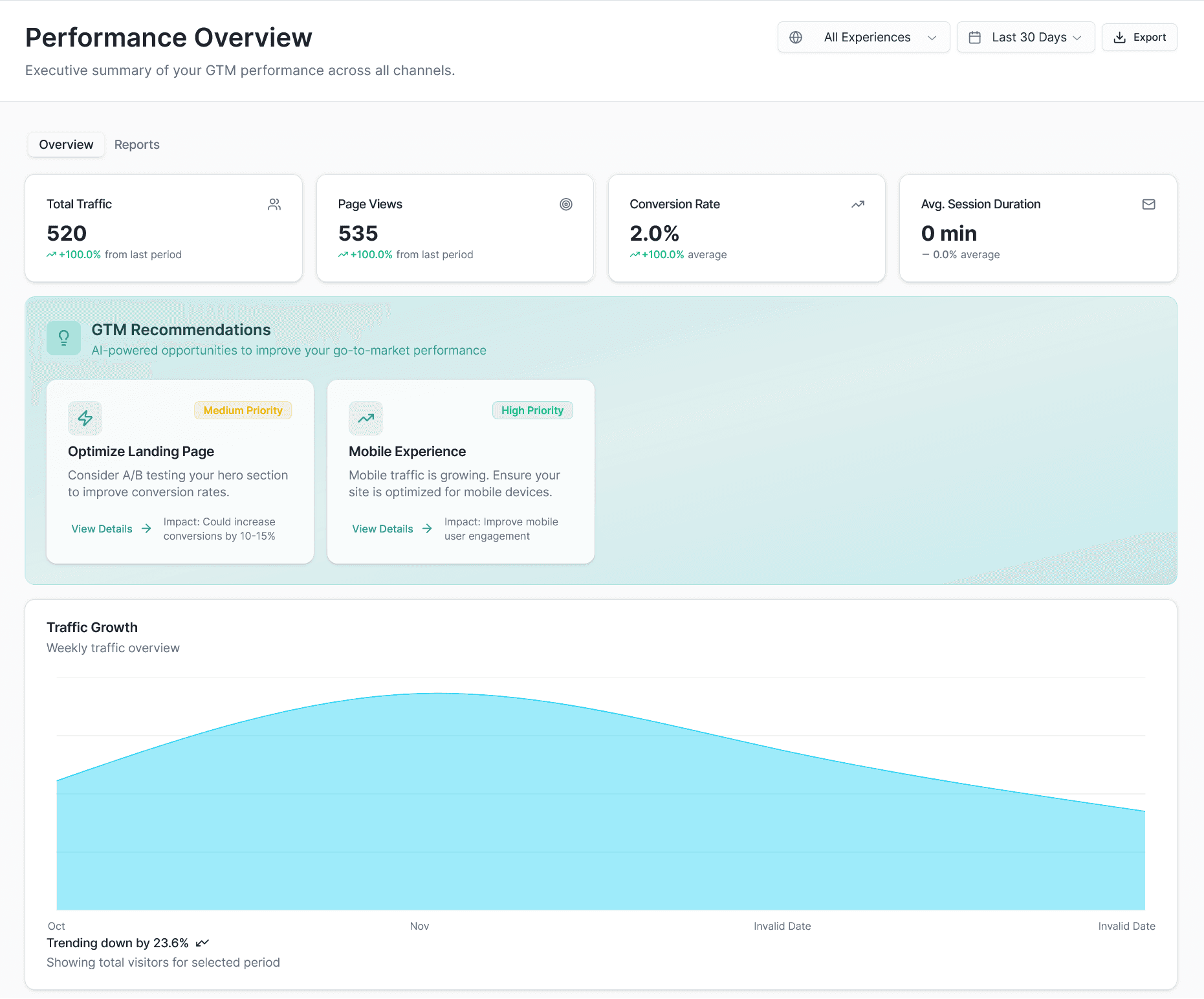
How does UX Brite show me where people abandon checkout? Combine conversion goals (the numbers — which step or form loses completions) with session replays and heatmaps (the behavior — watching real shoppers struggle on that step). Head to the analytics page to see what’s going on.
Can I A/B test a checkout change in UX Brite without another tool? Yes — UX Brite includes A/B testing, so you can build a variant, tie it to your checkout-completion goal, and ship the winner inside the same platform.
Can UX Brite recover abandoned checkouts automatically? UX Brite includes marketing automation, so you can trigger a recovery sequence when someone starts checkout but doesn't complete it.
Does UX Brite work for lead/demo form abandonment too, not just e-commerce checkout? Yes — the same workflow applies to any multi-field form: measure completion with a conversion goal, watch replays to find the field that loses people, A/B test a simpler form, and follow up with automation.
How quickly can I see results? Diagnosis is fast — watching ten abandoned sessions usually surfaces a fixable issue the same day. Proving a fix takes as long as your A/B test needs to reach significance, which depends on your checkout traffic.
Do I need to be technical to set this up? No — installing tracking and creating goals, heatmaps, replays, tests, and automations are designed for marketing and growth teams. Visit - https://docs.uxbrite.com for more information on setup.
Start improving your checkout
You don't need a redesign to recover lost checkout and form conversions — you need to see where shoppers struggle, fix one thing at a time, and win back the ones who slipped away. UX Brite brings the diagnosis, testing, and recovery into one workflow so each loop ships a verified improvement.